
Signature red
#C80200Primary actions, selected states and the warranty moment.
PINK SWAN / THE BRAND GUIDE
An architectural identity with a human heart.
Beautiful British-made home improvements. One team. Every detail taken care of.
01 / POSITIONING
Pink Swan helps homeowners across England create considered improvements and complete exterior transformations. The promise connects beautiful design with a coordinated experience.
“Transform Your Home.
We Take Care of Everything.”
Every touchpoint should feel confident, warm and attentive to detail. Lead with the customer’s home, then make the next step clear.
02 / THE ORIGINAL LOGO

Keep the architectural symbol, lettering and swan silhouette intact. The swan stays its original pink. The website uses no pink outside the logo.
Do not recolour, redraw, stretch, crop or apply filters, shadows or effects to the logo. Use the supplied original PNG and preserve its aspect ratio.
Download the Original LogoPlace the complete logo on a clean white or light neutral surface. Allow clear space of at least half the logo’s height on every side. If used on a dark composition, give it an appropriate light panel.
The supplied artwork is 512 × 83 pixels. It works well at approximately 215–275 pixels wide on the website. Obtain the original vector artwork before large-format print production.
03 / COLOUR
Red signals action and confidence. White, stone and charcoal provide architectural structure. The original logo is the only place pink appears.
#C80200Primary actions, selected states and the warranty moment.
#A90200Hover and pressed states for red controls.
#1B1B1EHeadlines, body text and considered dark sections.
#FCFCFBThe main canvas, with generous open space.
#F3F3F1Quiet background changes and supporting panels.
#DFDFDDFine dividers, input borders and structure.
#656568Supporting copy on white and stone backgrounds.
Indicative balance: 65% white and stone · 25% charcoal · 10% red. Photography remains the dominant visual element.
Use white text on red buttons and keep smaller body copy charcoal or the secondary text colour on light surfaces. Check contrast whenever text sits over photography.
04 / TYPOGRAPHY
Use for navigation, body copy, interface labels and primary headings. Regular to medium weights feel composed; stronger weights give compact interface text clarity.
Body: 16–18px · Line height: 1.6–1.8
Large headings: fluid, approximately 40–100px
Labels and captions: 12–14px
A selective editorial accent for the emotional phrase within a large heading. Use generously sized italic lettering with comfortable line height.
Use for emphasis, not long paragraphs.
Avoid cramped spacing, excessive italics and thin text.
Fallbacks: Arial for sans-serif, Georgia for editorial type.
05 / PHOTOGRAPHY & FILM
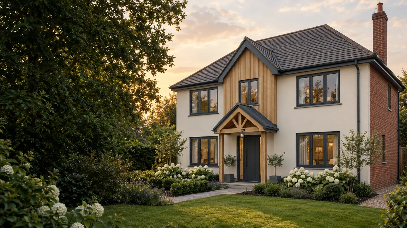
Approved customer photography may support completed-project claims. Choose imagery that is relevant to the service it accompanies. Keep the lighting, framing and colour treatment consistent.
Before-and-after comparisons must show the same property with matching camera positions and proportions. Keep a project gallery to that property; never pad it with unrelated photography.
Do not invent customer names, locations, testimonials, installation dates or results.
06 / VOICE & MESSAGING
Pair an aspirational headline with a clear explanation of the products, process or next step. Use simple language and speak to the homeowner’s priorities.
Avoid fake urgency, unsupported savings, invented reviews, claims of superiority and unverified technical ratings. Let considered design, transparent information and relevant evidence build confidence.
Use “Get a Free Quote” consistently for the main enquiry action. A consultation request is an enquiry, not a confirmed booking.
07 / REUSABLE DESIGN RULES
Use generous page margins and varied editorial compositions. Let one photograph lead each section. Fine rules and quiet surfaces provide structure without clutter.
Red primary buttons, deep red hover states and visible keyboard focus. Use concise labels and generous touch targets. Keep the quotation action accessible on every page.
Section entrances take approximately 400–700ms; interface feedback, 150–250ms. Use short upward reveals, lightly staggered cards and restrained hover zoom on portraits and photographs. Honour reduced-motion preferences.
Make before-and-after controls usable with keyboard, mouse and touch. Label both states clearly. Gallery viewers must provide a visible close action and keyboard navigation.
Use persistent labels, helpful validation and clear state changes. Preserve entries on error. Show success only after genuine acceptance; describe an email draft as a draft.
Prioritise readable copy, comfortable spacing and clear actions on small screens. Avoid horizontal overflow and oversized media downloads. Keep content accessible without animation.
08 / CONFIRMED BUSINESS INFORMATION
Premium British-made home improvement products. Serving homeowners across England. A complete project service and a 15-year warranty.
Windows, front and back doors, porches, conservatories, cladding, fascias, soffits, gutters and complete exterior transformations.
0113 880 5789
pinkswan.windows@gmail.com
“Applicable cover, terms and care requirements are provided with your quotation and warranty documents.” Do not add unconfirmed exclusions, insurance backing or additional guarantees.
Use approved reviews and completed-project evidence when available. Otherwise explain clear quotations, coordinated service and warranty information, with a way to request relevant examples.